Wanderlust: Museum of Travel is a fictional museum that features a vast collection of souvenirs and trinkets from all around the globe.
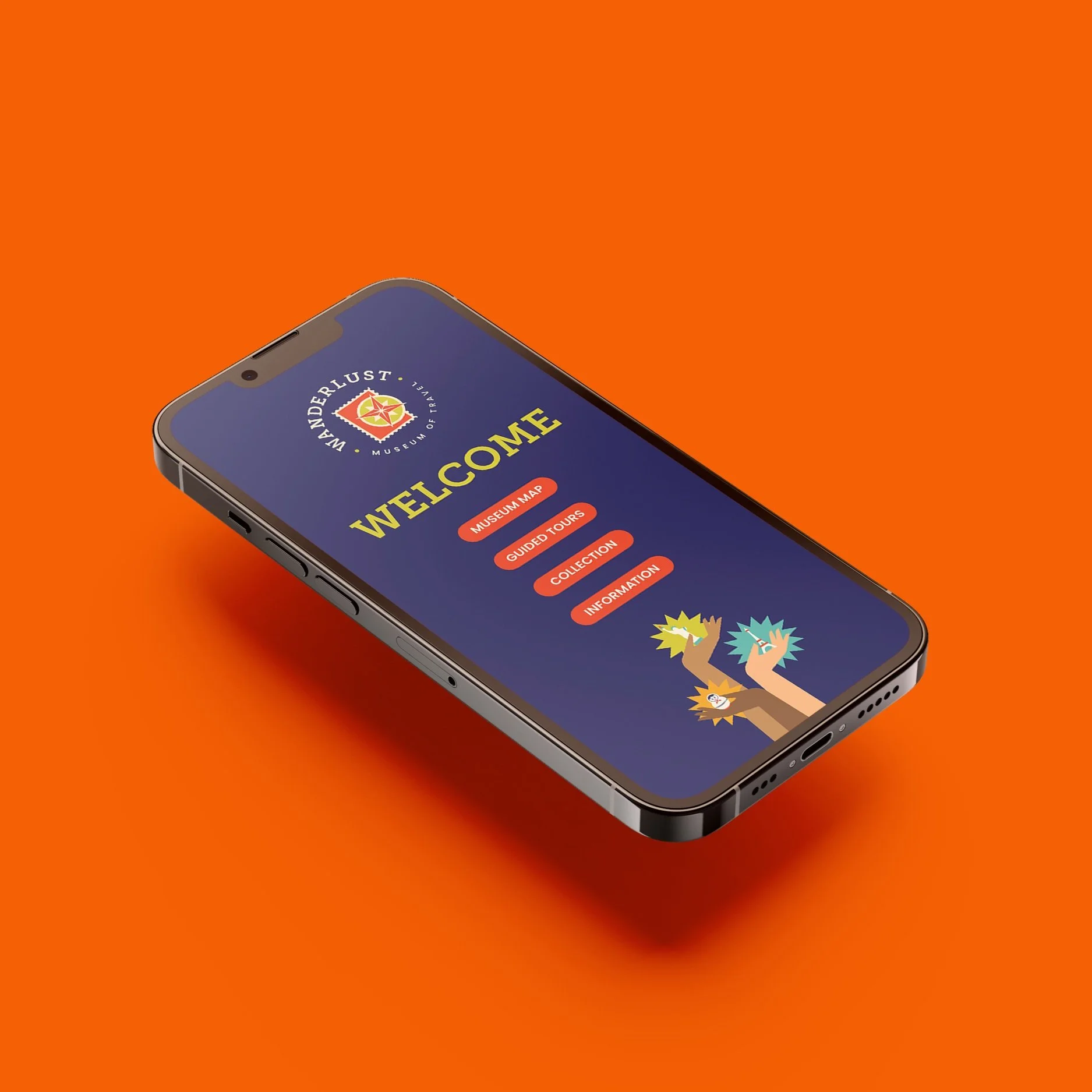
Seeking to revamp their visual identity and cater to a wider audience, this rebrand utilizes elements of the previous branding with a modern flair. Delivering to the client’s needs, I created a brand kit that speaks upon a refreshed visual identity through a new logo design, print assets, directional signage, web and app design, merchandise, and packaging. The rebrand brought about positive results where, in a collective of over 35 young adults, all of them found the new brand identity to be more engaging and appealing to their age group.
• Branding
• Art Direction
• Packaging Design
• Print Design
• Illustration
• Typography
• Web Design
• Photography
Deliverables
Tags
Branding Guide
Printed Collateral
Product Design & Packaging


Design a comprehensive branding system for a fictional museum. Conceptualize the museum by first developing a mission statement and providing 20 original photographs of items that would be found at the museum. Establish the museum’s target audience and evaluate the personality, tone, and imagery to be used in the branding. At a minimum, the branding guide should include the following deliverables: logo design, typography, color palette, brochure design, poster design, and packaging. All deliverables should be consistent to the brand’s overall tone and visual language.
Project Brief
-
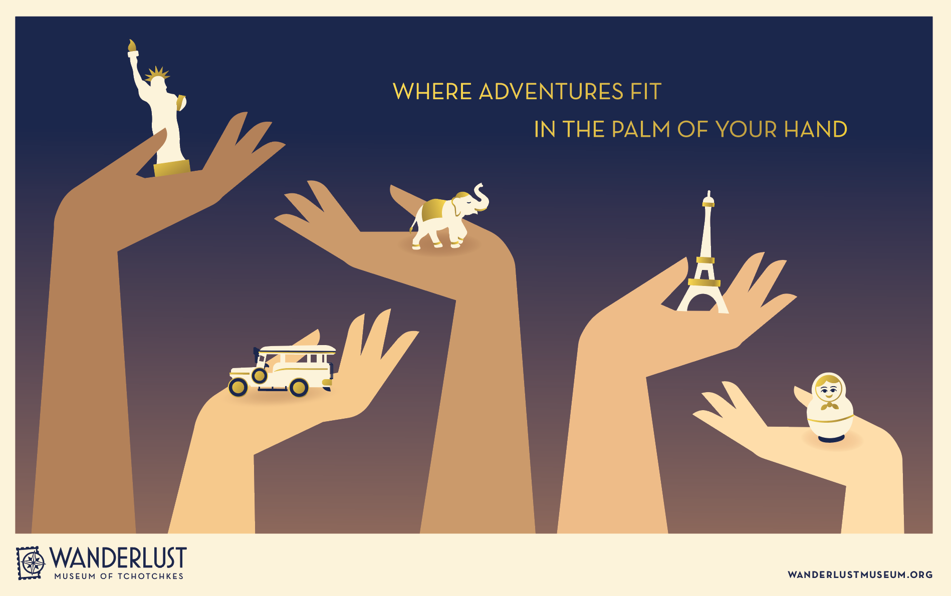
“At Wanderlust, our collection of beloved souvenirs celebrates the paradox of the human experience. By highlighting our rich diversity and encouraging connectivity, each little trinket holds memories of our past, tells the story of who we are, and invites us to share who we are with the world.”
To reflect this mission statement, my goal was to highlight diversity and establish a tone that is welcoming and personable to a broad audience.
-
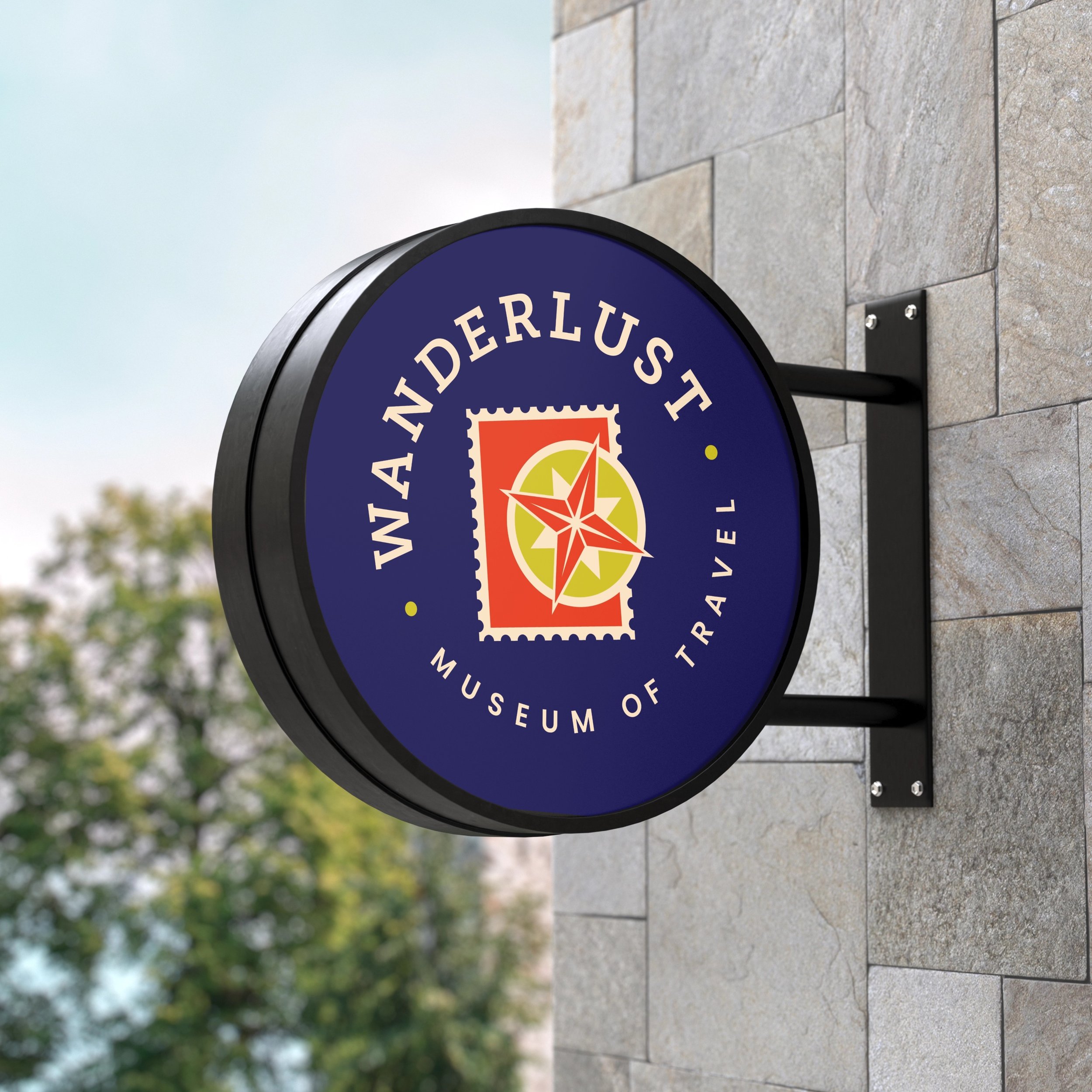
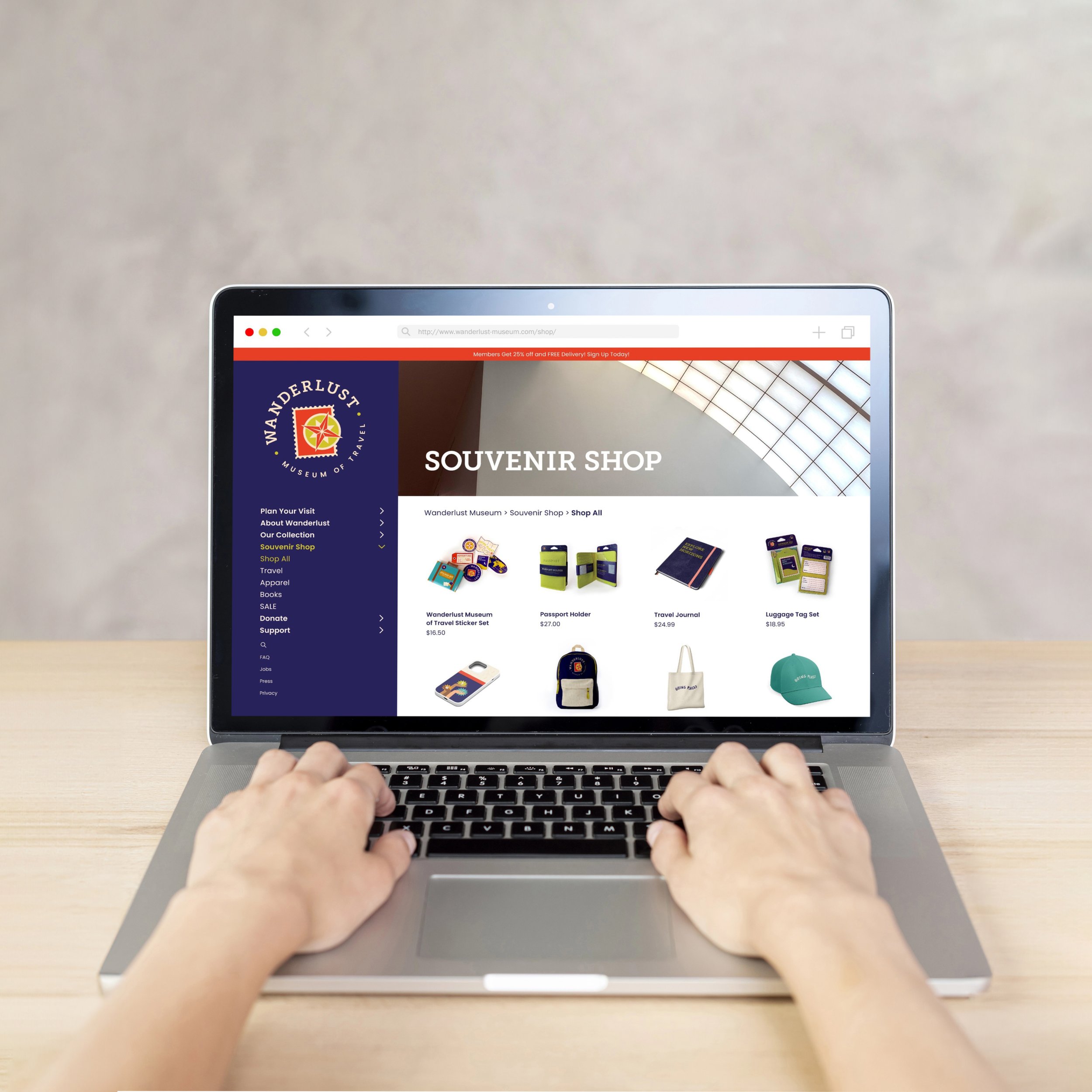
The museum’s new branding features an expanded color palette that incorporates vibrant and youthful tones of green, orange, and teal. These colors work together with the new star shaped elements to create a style that communicates a more energetic tone, appealing to a broader audience. This visual language is carried out throughout every aspect of branding in print and on digital platforms.
-
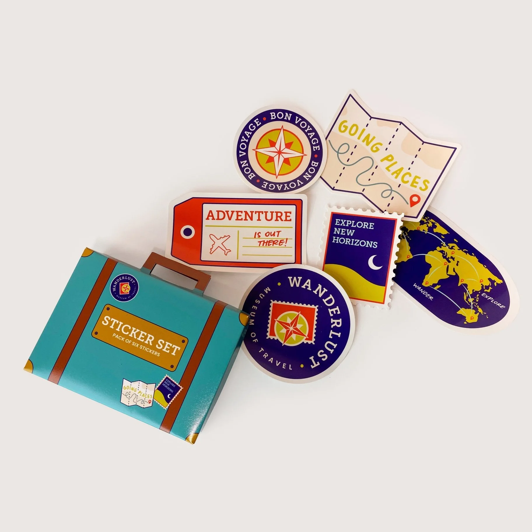
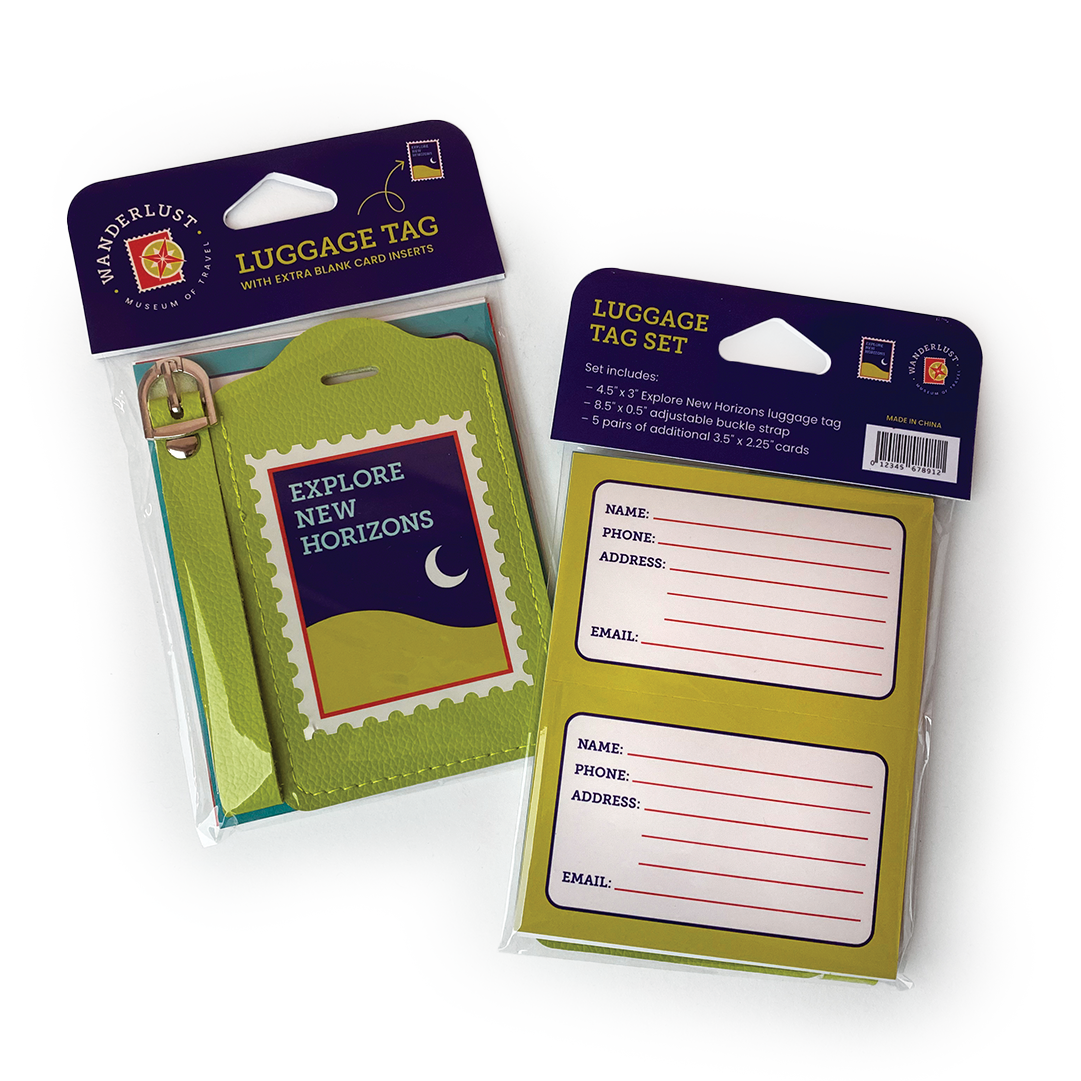
Building upon a playful and youthful tone, Wanderlust uses visual cues that reference travel to create a cohesive and immersive environment that evokes a spirit of adventure. Entry tickets are modeled after airplane boarding passes while posters are designed to look like oversized postcards. The museum brochures mimic US passports when closed, but unfold to reveal a world map highlighting different souvenirs in the collection and where they are from. These references are even extended into the museum merchandise, namely the sticker pack that is packaged as a mini vintage suitcase.
Objectives
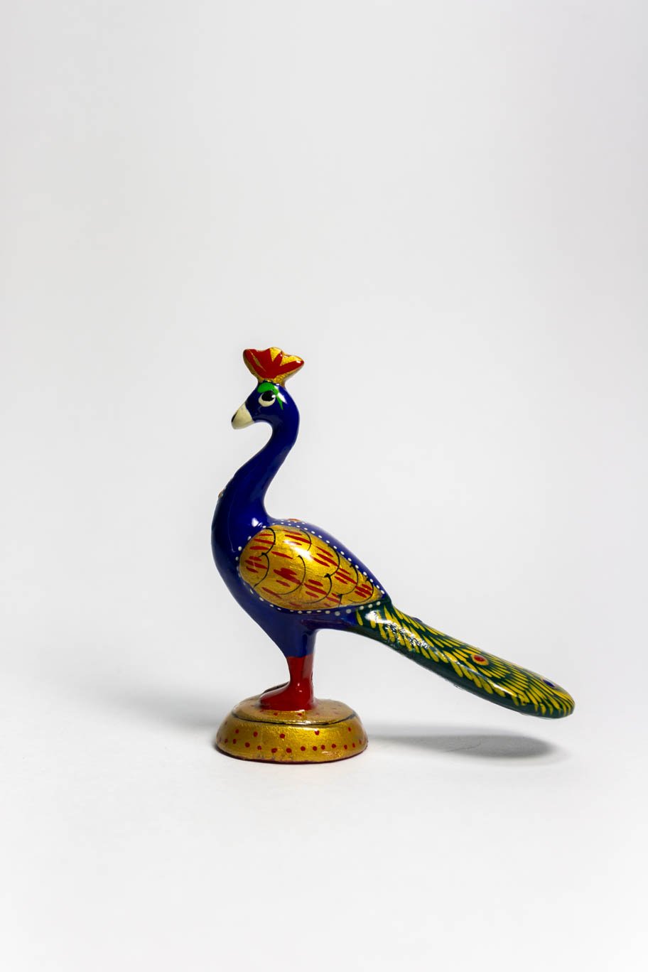
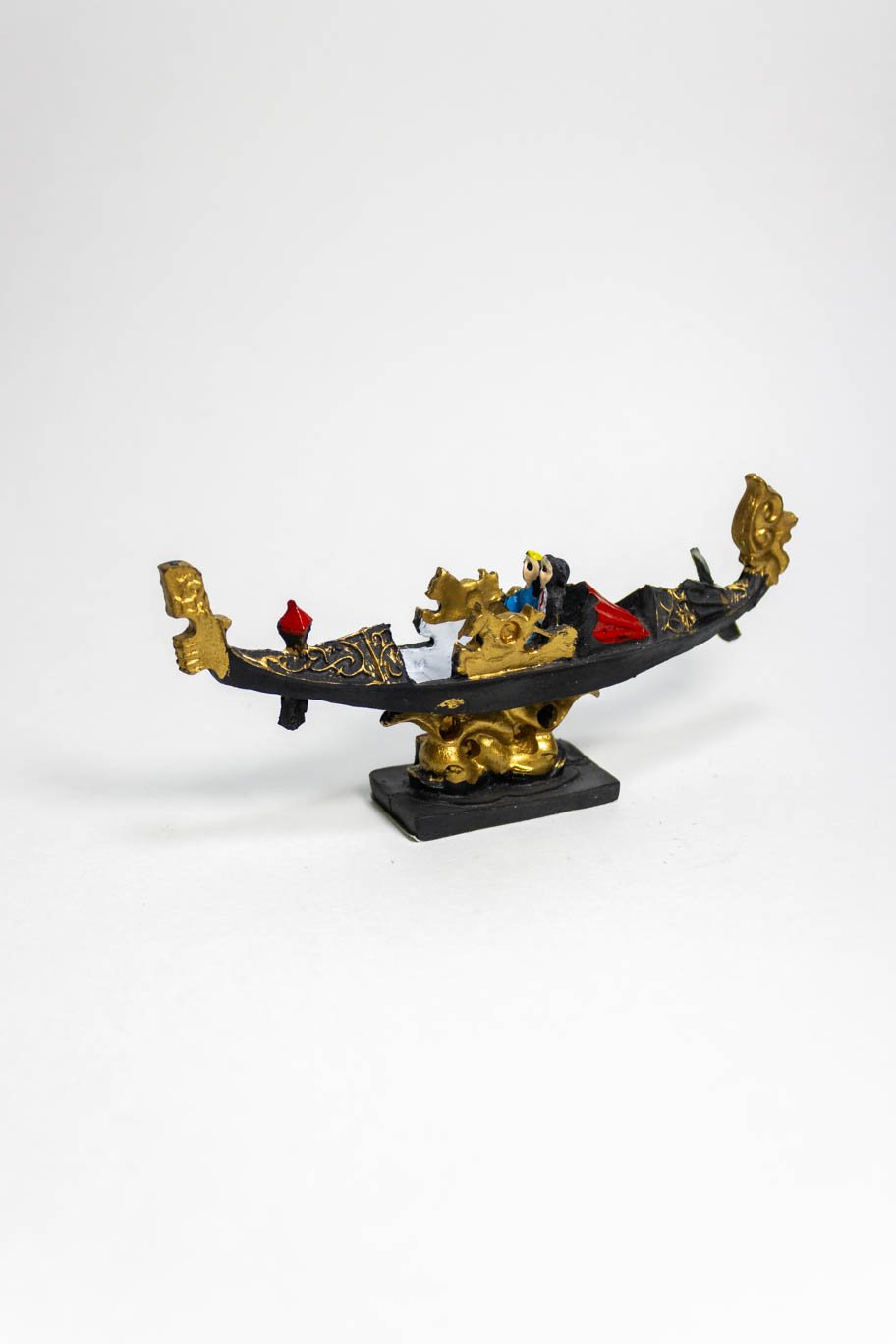
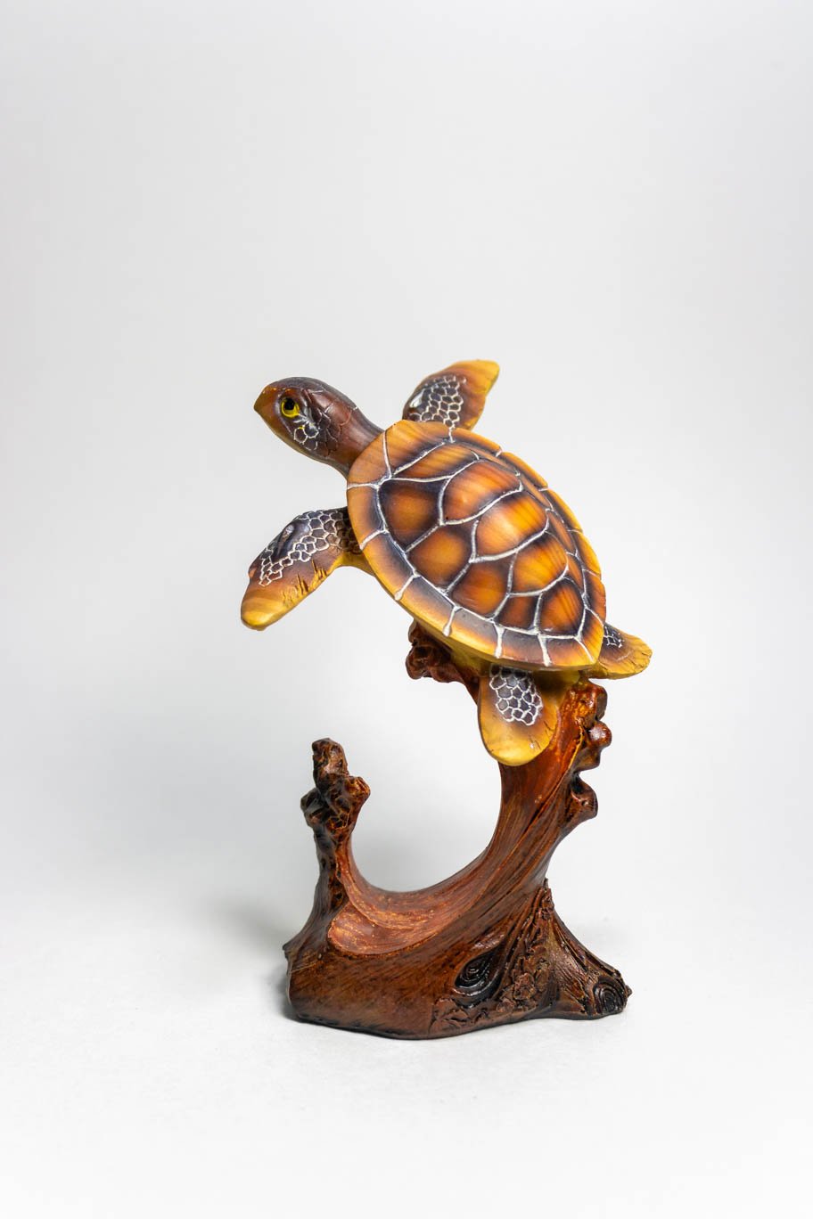
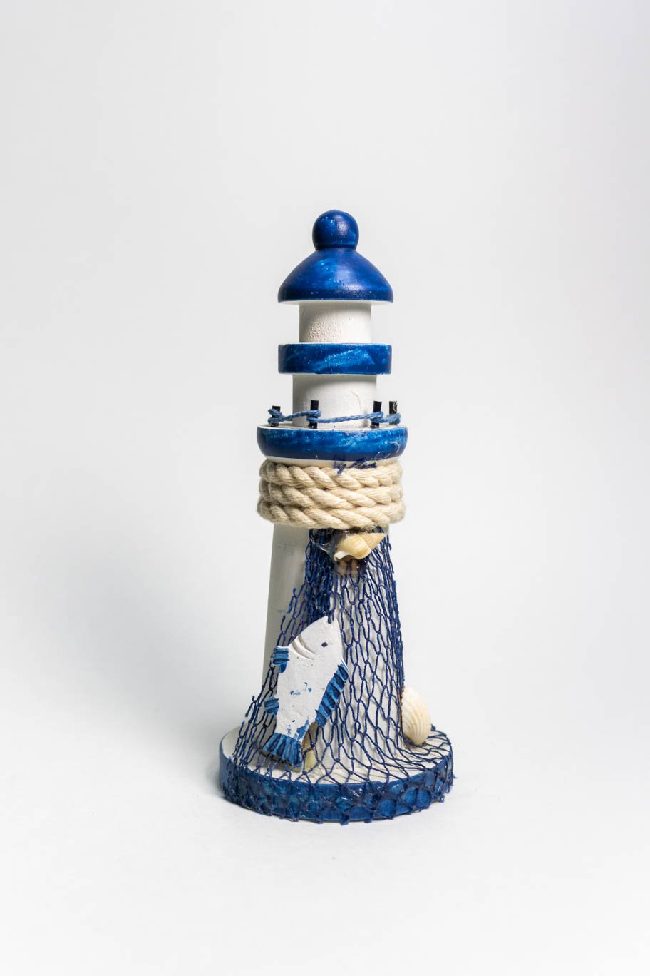
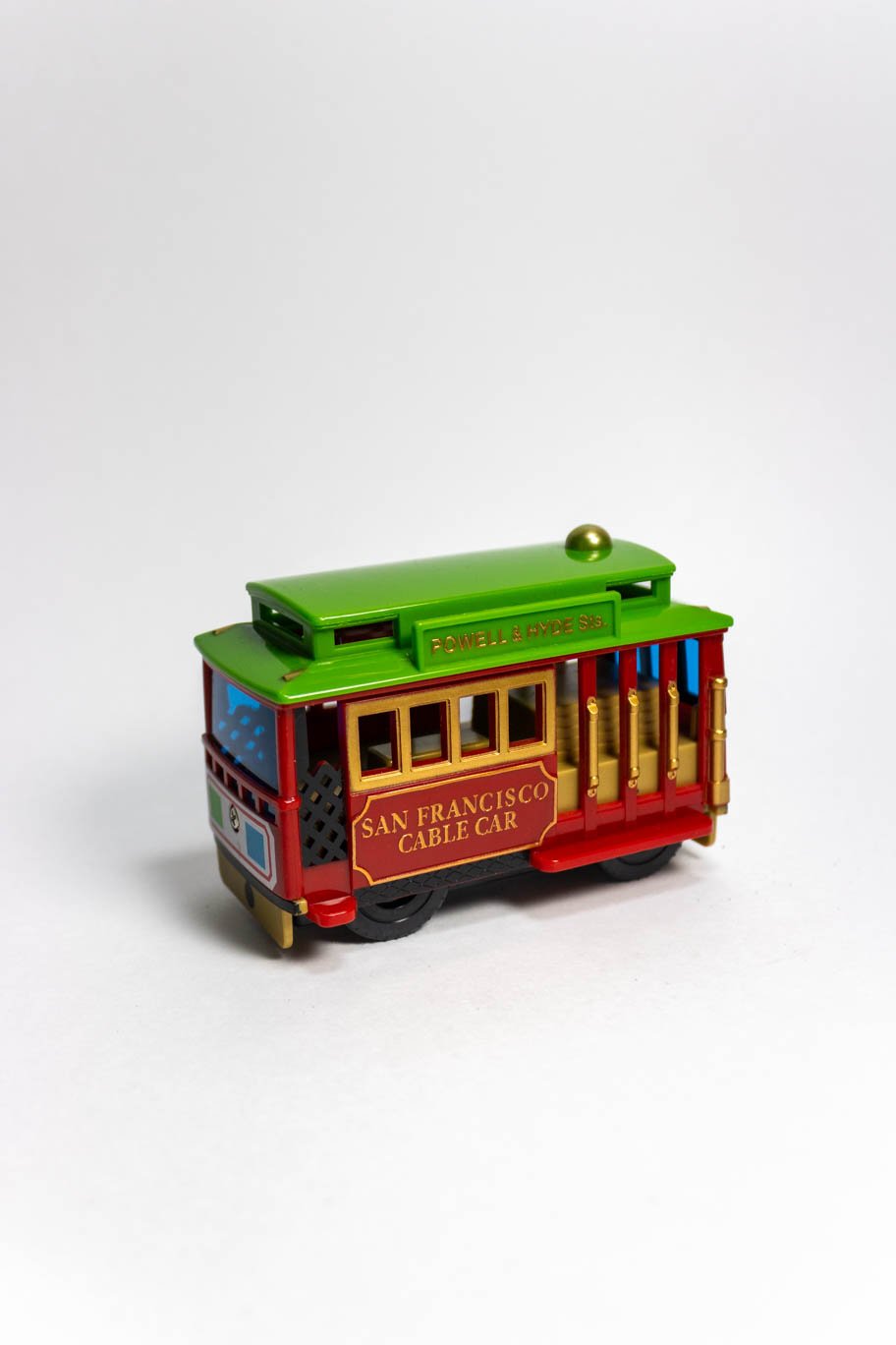
Photography
20 original photographs were taken to be shared at an initial brief presentation.


Over 200 sketches were created in the initial stages of the logo design.

Preliminary Sketches


Originally titled “Wanderlust: Museum of Tchotchkes,” I envisioned the museum’s branding to be art-deco inspired, using gold, gradients, and specific typefaces to embody this style (as shown in the logo and poster design featured below).
However, as I continued work, often found myself seeing a disconnect between the intended tone of the museum and the visual language of the designs. Reevaluating my work brought me to changing the title to “Museum of Travel,” and implementing a new branding that would better reflect the essence and mission of the museum.
Original Branding

Final Logo
The project’s color palette was selected to be reminiscent elements associated with travel, such as a navy blue of a US passport and the green and seafoam embodying the earth and ocean. A red-orange tone was used to create a split-complementary color palette.
Color Palette

A slab serif font was selected as the primary typeface because it was visually similar to the stamp border featured in the logo design. It was paired with a sans serif font and my own handwriting.
Typography
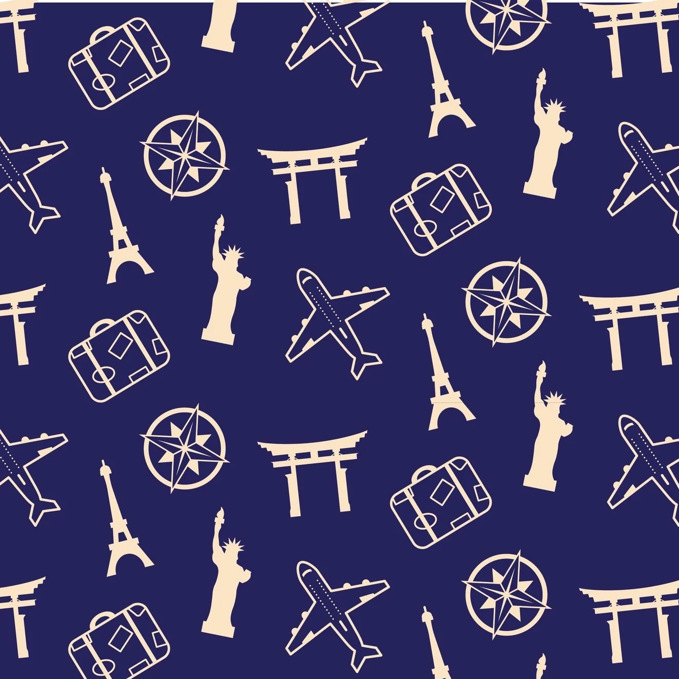
Vector illustrations drawn in Adobe Illustrator were used to create patterns and motifs that to reinforce brand identity across print and digital collateral. The subjects of these illustrations originated from the initial sketches and poster design prior to the rebrand.
Illustrations