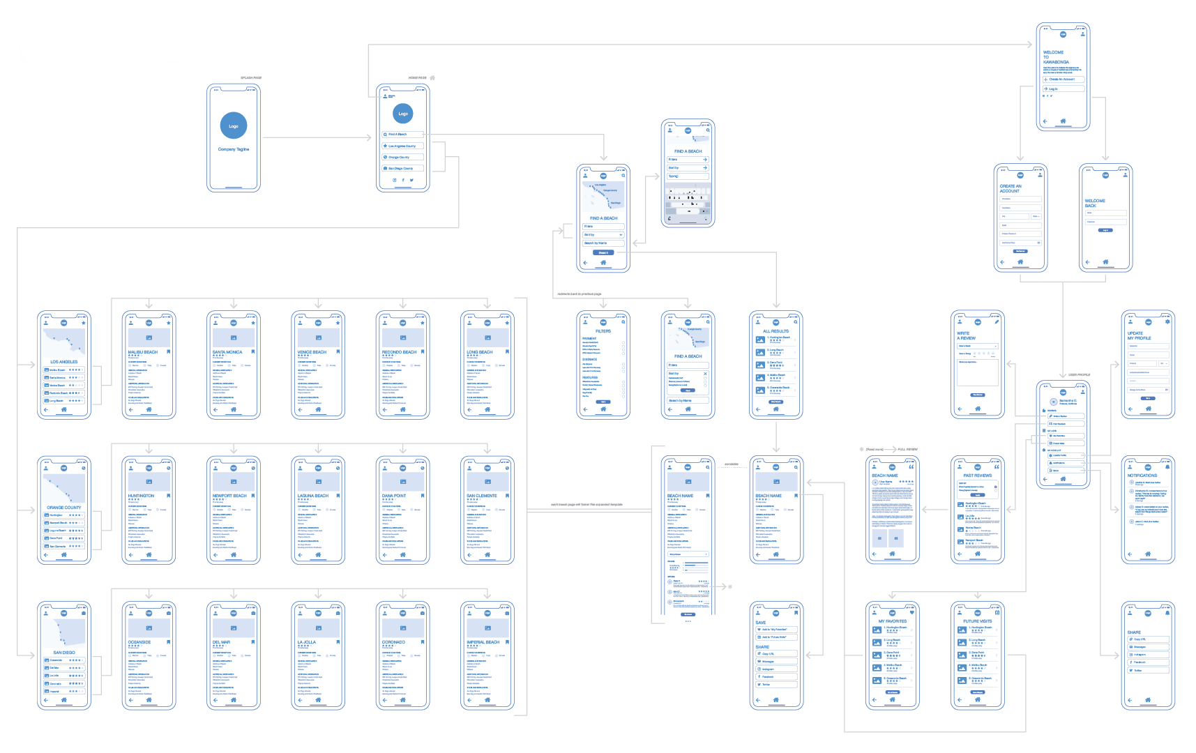
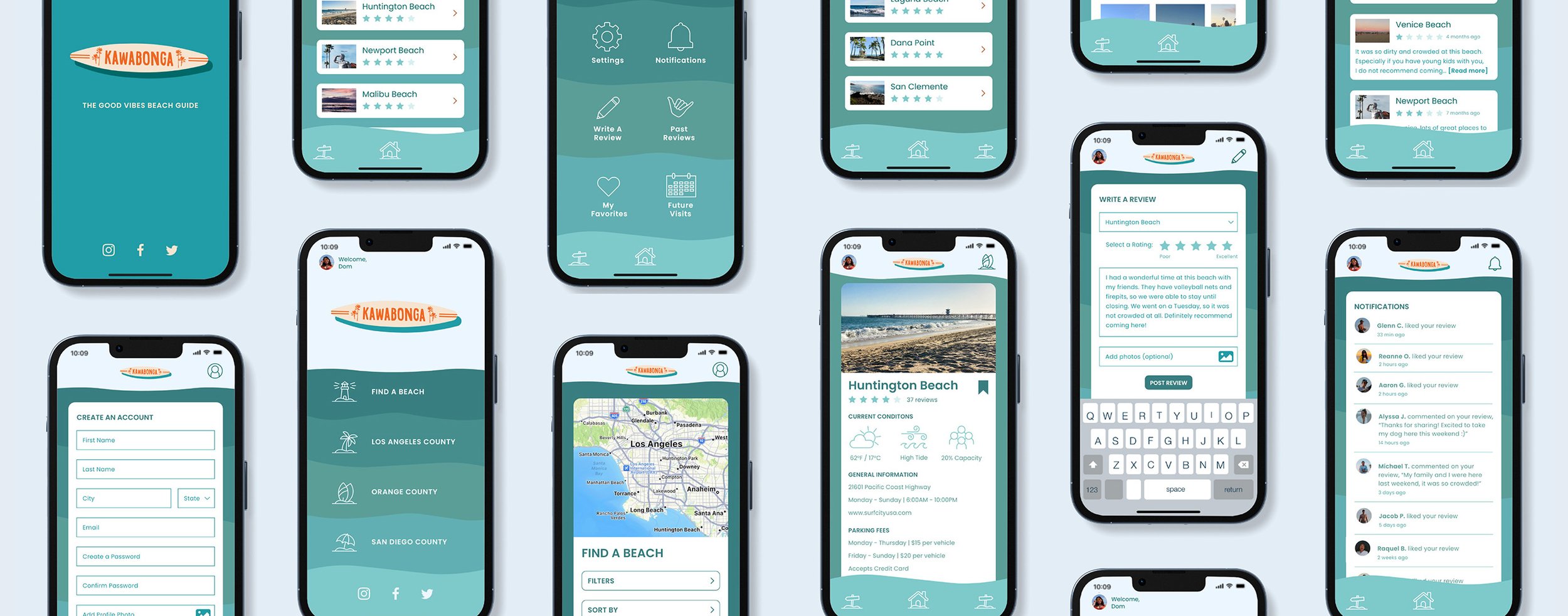
Kawabonga is a mobile app that informs and connects people seeking to visit Southern California beaches in Los Angeles, Orange, and San Diego.
From conception to follow through, I designed the app to be both a visual representation of Southern California and a functional resource for users. The branding and prototype showcases how this app aims to provide up-to-date, streamlined information in a way that allows users to navigate with ease while fostering connectivity. The prototype was received enthusiastically from a pool of over 700 potential with many users expressing demand for the product.
Tags
Process
• UX/UI
• Art Direction
• Branding
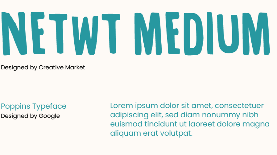
• Typography
• Photography
• Illustration
Strategy & Research
Wireframing
Branding
Prototyping

Design a letter size (8.5"x5.5" folded) booklet with 16 spreads/32 pages including front and back cover. The main focus of the booklet is a step-by-step recipe guide featuring original photographs and accompanying text. The amount of images should be appropriate for the amount of steps needed to make the dish/dishes. The final product should be visually striking and cohesive in style, displaying a particular mastery of photography, composition, and layout. Designer has full creative freedom over art direction and themes, so long as the presented concepts are communicated clearly and effectively.
Project Brief
-
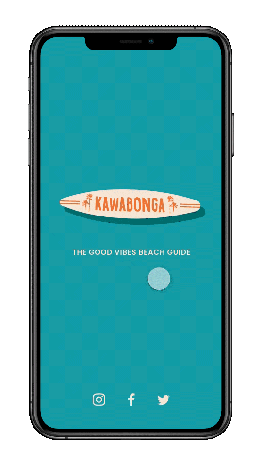
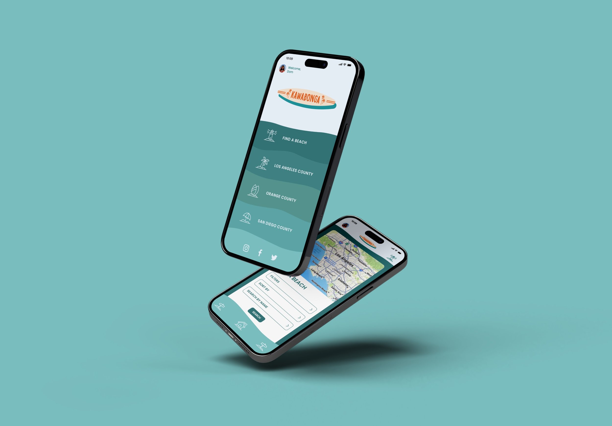
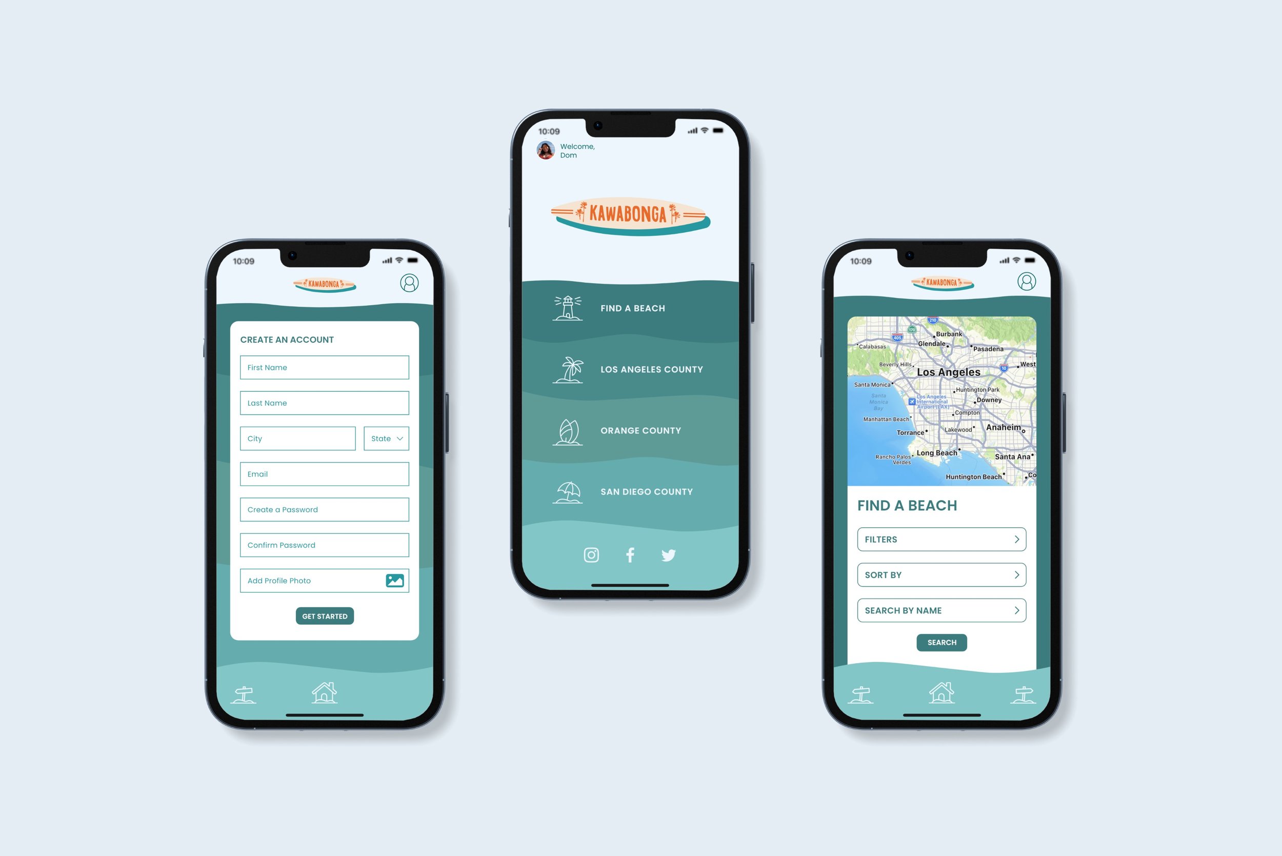
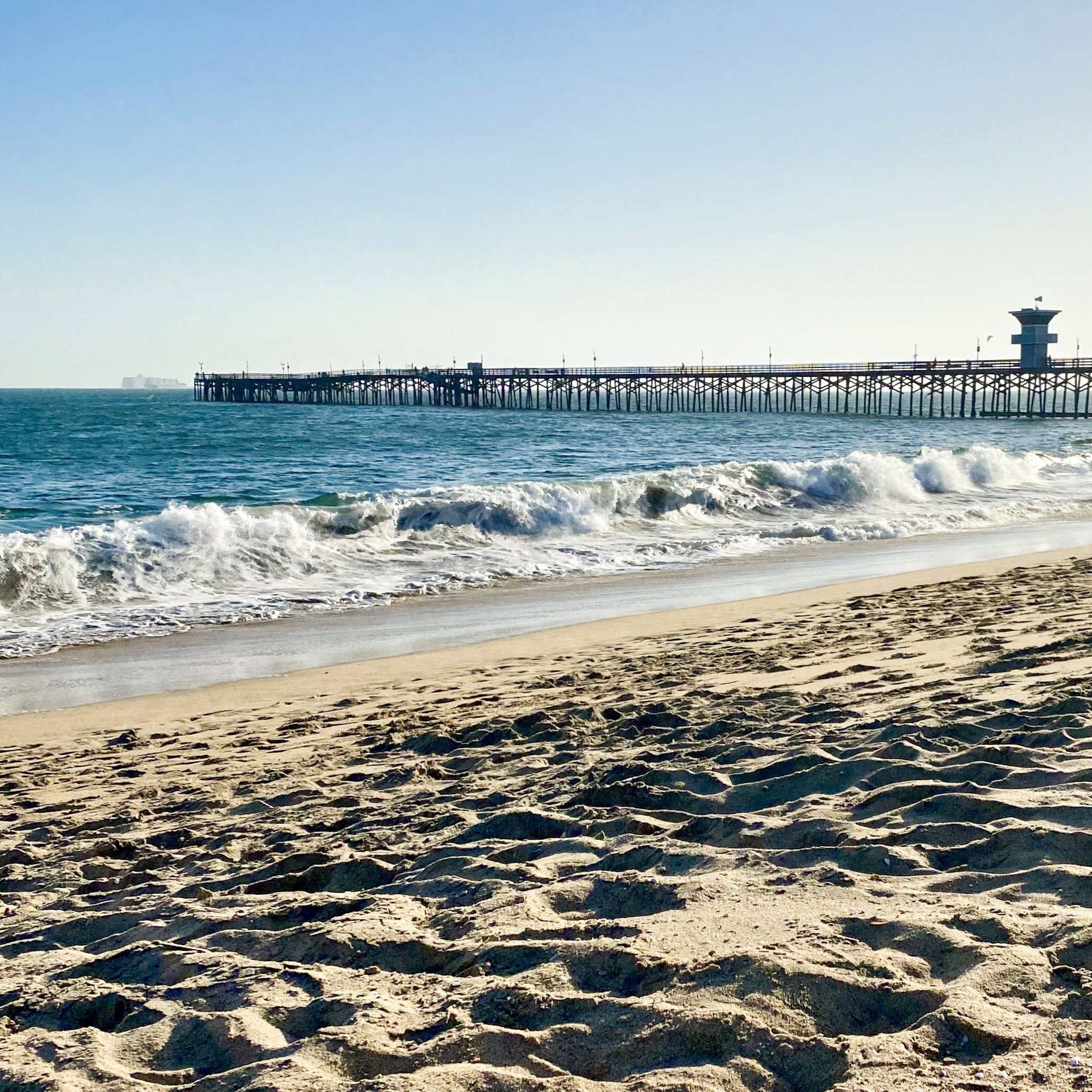
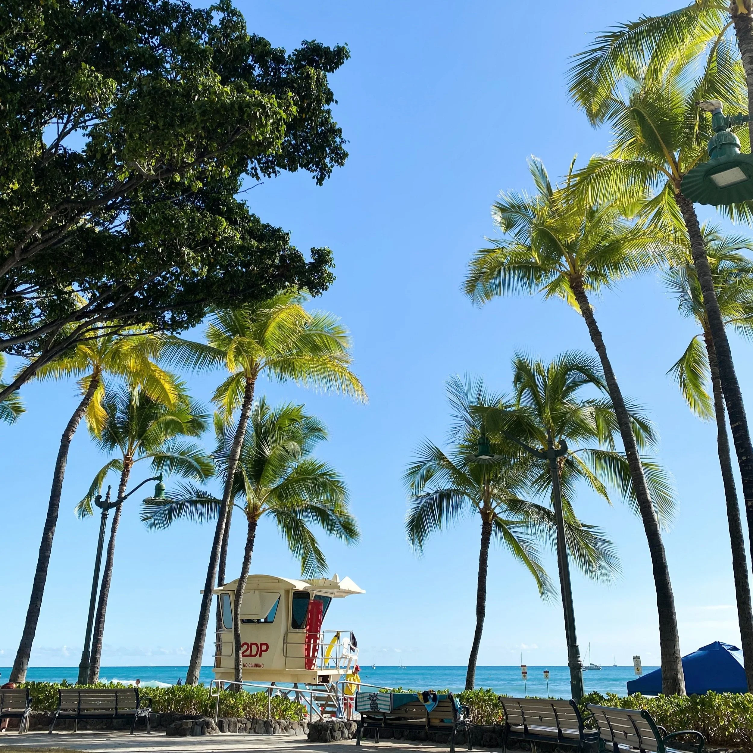
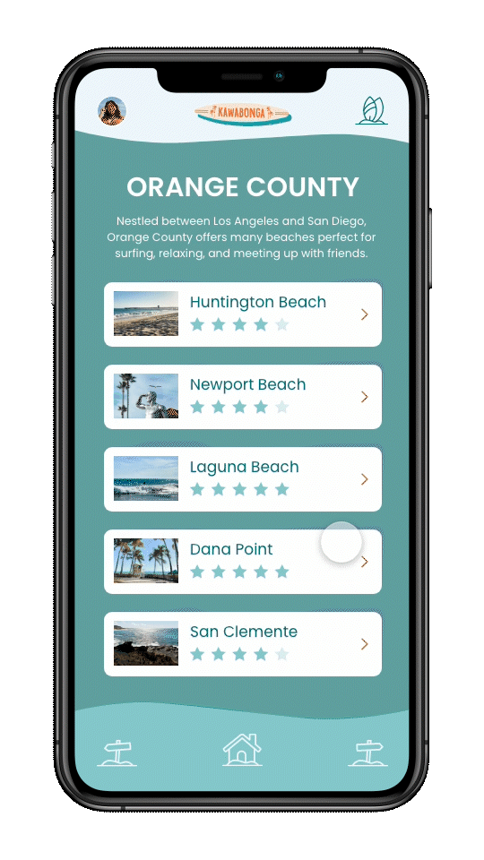
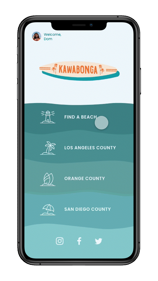
The name and branding of the app is heavily influenced by Southern California surf and beach culture. The color palette and wave-shaped section dividers are reminiscent of the ocean waves while the orange accents give the warmth of the California sun. Inspired by the study of the user environment, icon elements include palm trees, lighthouses, surfboards, and umbrellas.
-
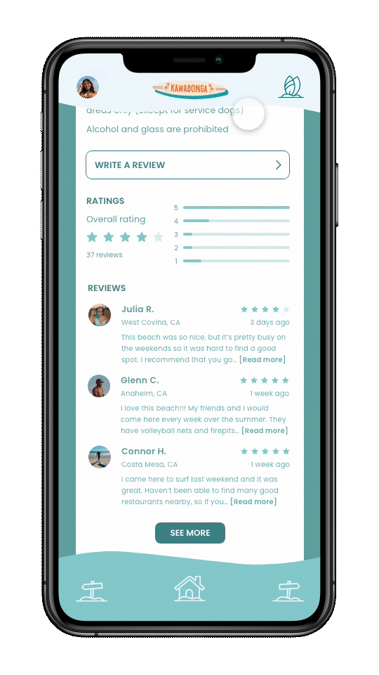
Designed with the average beach goer in mind, the app allows users to search for beaches by name, by filters, or by county. Information is presented in an organized and intuitive manner, featuring up-to-date information: hours of operation, crowd meters, tide and weather conditions, upcoming events, parking details and other amenities. The prototype’s functionality showcases that the app would be a resourceful tool to help users feel prepared and plan their beach trips with ease.
-
The app also offers user shared information that promotes connectivity and helps foster community. Users have the capability to create an account, add friends, leave reviews, share photos, give advice, and host events. This aspect further caters to the needs and interests of locals and tourists alike.
Objectives
Photography


Color Palette
The project’s color palette was selected from the fully processed images, ensuring a cohesive color story throughout the design. These colors were further refined in order to evoke the warmth and vibrance of Filipino culture, using tones reminiscent of the sun and scenery of the Philippines.
Typography
To further celebrate Filipino culture and talent, the two main typeface used for this project, Bawal Sans and Quiapo, were created by Filipino designers.
Navigation & Information Icons
To designate the different recipes/chapters, icons were vector illustrations were created in Adobe Illustrator. For the acknowledgments page, I depicted mano po, a Filipino custom performed as a sign of respect for our elders. This illustration inspired the poem featured at the end of the project.
Wireframe
Final Prototype